AI, Design, and Interaction

Today’s lesson started with a brief introduction to AI and overlooked to a website that has been designed by Google to AI users. Basically, people have shared their works and experiences regarding AI through this platform.

Both topics that have been covered during the introduction to AI was very confusing and complicated for me. The first one was mechanical induction that had some different sorts of shapes and we had figure it out what is included and what is excluded in these shapes. Shapes were almost different from each other, but some of them had the same size. Still, I could not be able to differentiate how makes these ships included and excluded type. The second was The Perceptron that looked like a mathematical concept and had no clue what its all about, but later my classmate has explained it clearly. Basically, AI Machine needs to be trained for the expected output, and that training could be in the form of gestures or any other simple.

Lastly, we explored the projects that others have done in the AI field, which were excellent, and thoughts were coming in my mind how could these projects be used in the interaction design field. I am still suspicious about AI and looking forward to learning and know more about AI in coming lectures.

Next Day

Today the lecturer spoke about the Wekinator interface, and we tried some examples. The main idea was to explore more and know about the capability of Wekinator. While trying examples, I was struggling to understand which input file and output file have to be selected and how they related to each other and what number of input and output to needed to be entered and how can I distinguish between continuous and classify output. Later, I understood that in front of each file name, the input and output value had been defined. I tried a few examples, such as colors, FM synthesis, and drum sound. My understanding of using a Wekinator was that when I recorded one simple in one point and another simple in a different point, then the Wekinator fill the gap between the two points layers automatically. In this way, the Wekinator generates for those positions that I have never recorded any simple has an output value.
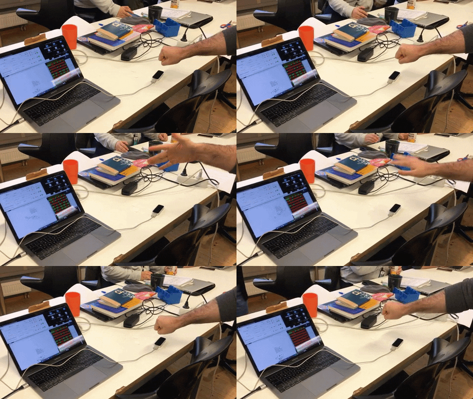
This week’s articles were mainly about the Wekinator and how useful this application is and especially for those who deal with music. During the reading of the article, I found out that how Wekinator was useful to be a medium that is capable of detecting very complex gesture movements of a performer and convert it to meaningful information that users could use it in a more controlled way. That could also help the performer to extend its performance to a higher level. Kontrol is the device that has the sensor for accelerometers, which has the ability to trace high exactness in gesture recognition and provide specific data, even the movement of the fingers could be the most complex. I thought Kontrol could be very useful for the sign language as well. Through Kontrol, we can able to communicate with people who are unable to speak (dumb) if we could able to trace the sign gestures and translate them to text. I hope that I can make this one in the future.

Weekly Project

I started by experimenting with all examples, some of them worked, but some of them did not work out for me. Truly speaking We had less time for this assignment, and also we just need to work with sound, so the ones that did not work we tried to avoid it. Through different device sources, we tried to train the sounds with the help of Wekinator, such as a mouse, webcam, and phone. We thought interacting through the phone could be cooler and also provides mobility while performing.

Our concept was, how we could use sound in our daily life products such as hairbrush. We though that if we could develop a brush that has the capacity to identify the sort of hair and could produce sound to each type of hair. Then after the identification the brush has to function according to hair style.

MotionSender was the app that is used to send the mobile phone sensors value to Wekinator. After a few experiments, I realized that the gestures simple that we have recorded are not being recognized accurately by the Wekinator. The output is maxing up with the other gesture simple. Later, when we tried with the classifier type, the outputs were more accurate and acceptable for us.
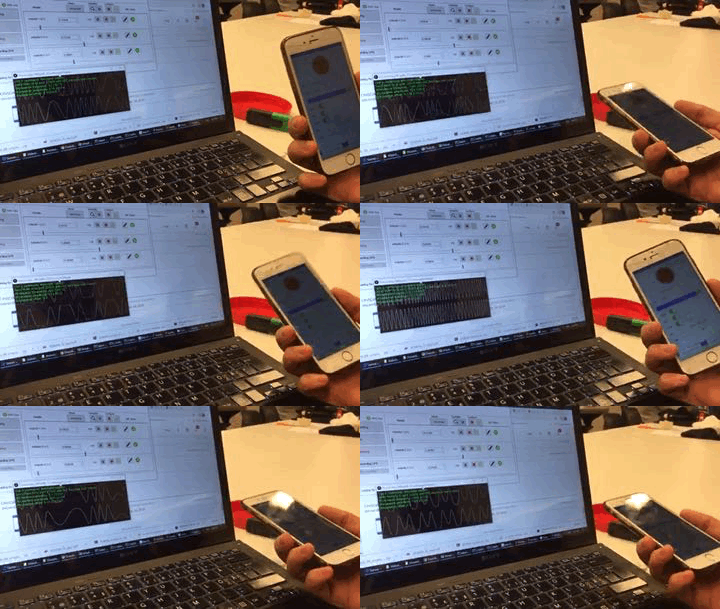
We tried to have multiple device input to Wekinator so, including interacting with a mobile device if we can also interact with the webcam at the same time by increasing the input value, but this did not work out. Even we also though if we can open 2 Wekinator surfaces at the one laptop and change the listening port number in Wekinator as well as the processing file, but still did not work for us. I hope we had more time that we could come up with other cool stuff working through Wekinator.

Presentation Day!

Before we proceed to the presentation, the lecturer wanted us to explain briefly about our project. Controlling the sound from an external device was not easy, so almost none of our classmates had explored this area. Personally, it is awkward to show similar projects on this day, which some of the group had, and this method could also give them hints that even with the mobile sensor, there is a possibility to steer the sound through the Wenkinator. During experiencing classmate’s projects, I have found leapMotion more interesting. It can collect data from your hands and fingers movements. Basically, the device is not embodied in the body that helps to move hand freely left to right or up to down. Controlling the sound with the LeapMotion device through Wekinator gives a sense of magic for a moment, and this was the lightest way to play with the sound.
During the presentation, we explained the concept of the project that how we can use the sound effects in our daily usable tools such as a hairbrush, and also we talked about the challenges that we have encountered while developing the project to a higher level. We got a positive critique from the lecturer, and he added that the idea to include sound in tools such as hairbrush is unique, and it could be fun and playful. The sound could motivate them to engage with the artifacts for a more extended period. I never thought about the playful aspect before because most of the children try to avoid brushing their hair and teeth, and they find it annoying. The sound effect in such items could be encouraging for the children to perform it regularly.

During this week, I have realized that AI fields have the potential to improve the interactivity of any sort of product and capability to make human life more comfortable. Finally, I have decided to choose AI as my elective course for next term and explore this field a bit deeper.
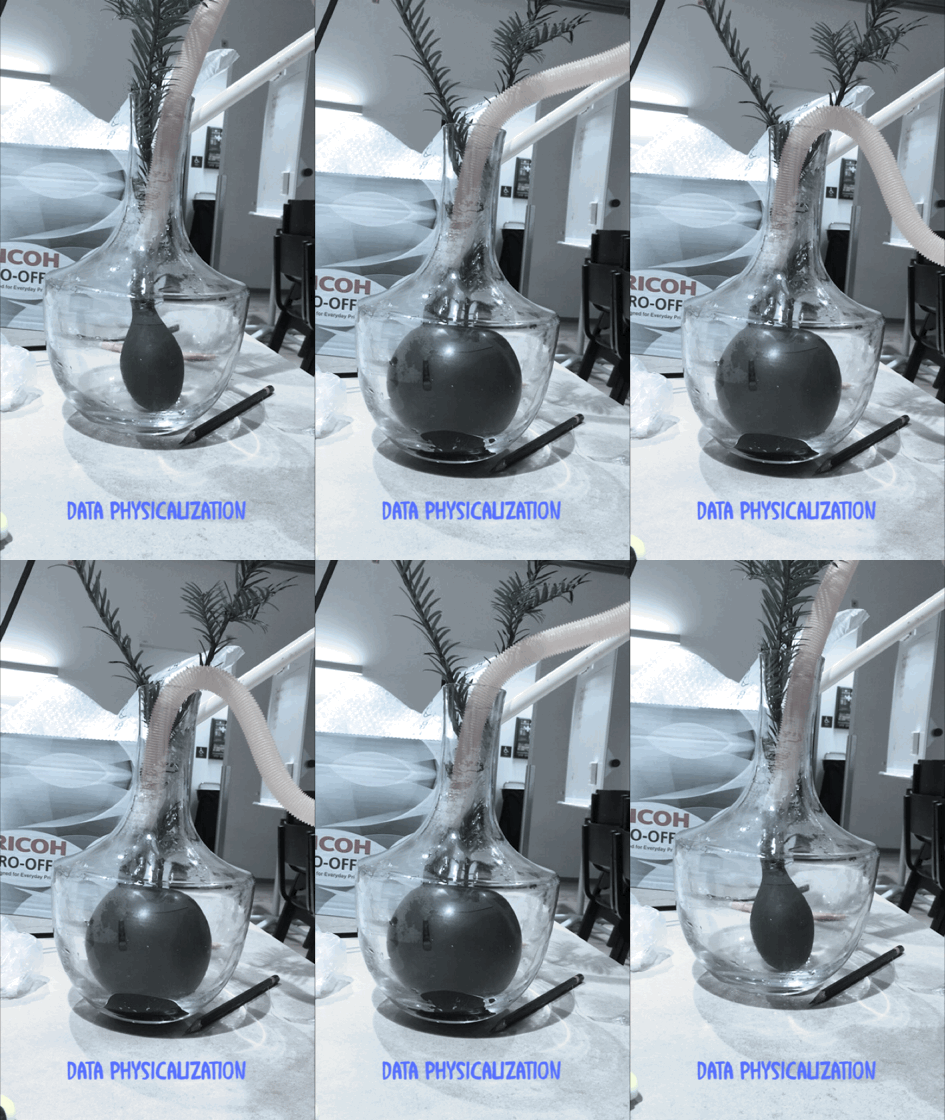
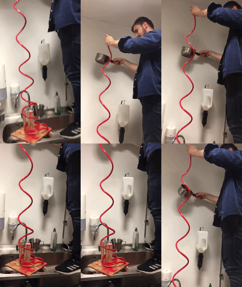
Data Visualization / Physicalization

Today’s lesson was about data visualization and physicalization. Furthermore, we also got to know a bit about data physicalization history and how, in the past decade’s people wanted to see data in a physical form. I thought that at that time, people would have limited access to data because the technology and resources were not developed as now. Later, I have understood that how they used cube, balloon, and bars to shape the data in a physical form. However, I was more curious to know more about their motive to see the data in the physical form and how they collect their data. Usually, at that time, people were processing the data for information.

The next topic that has been point out was about static data and dynamic data. This subject was more straightforward to me, and the first example came up to my mind was the monthly salary, which static due to the amount is fixed, and the same amount is being deposited every month, according to the agreement signed. However, when a person started to pay for monthly expenses that could be dynamic due to it could be deffer in each month, and the amounts keep changing every month according to the person’s expenses. In this case, it is also means that static data is non-controllable, but dynamic can be control and effect according to the behavior of the object. The only question that I was concern about it that there are elements that provide data in both forms of static and dynamic such as electricity bills. The charges for line and meter are fixed, but the charges for the units are variable, which is dependent on the user’s consumption. So what do we say for such data that is generated in both forms?

The last part of today’s lecture was about the difference between informative data and provocative data, and before the lecturer explains it more. We got a chance to think a bit and differentiate between these two sorts of data. My first thought was that both sorts of data give information. The informative data deliver knowledge about the status of something, but it does not force me to react. Provocative data force the user to react else it would be too late to take action. The best example could be the car fuel indicator when it half; Through that level graph, it delivers information that the car has left half fuel, but I have the option to refill it or do it later. However, if the indicator reaches the bottom, and the red light turns on, then I have to refill it before the car is out of gas.

Weekly Project

The central concept of the assignment was to come up with a design that could show data in a physical form. The data should be informative and provocative and coherent with each other.

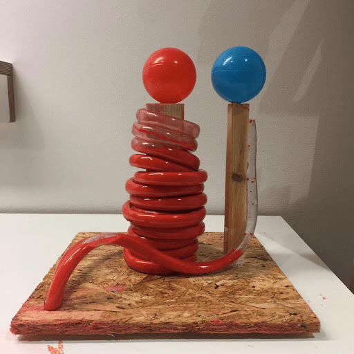
During the ideation part, we had several ideas in this context of the data physicalization. We thought about the kitchen oven, pollution, and reaction of western media to violence that happens on different parts of continents. The concept of the kitchen oven was to show the degree level of food cooked. We thought this is more informative and less provocative, and everyone would prefer to see such data in digital form instead of in a physical form. The two other ideas were more provocative and informative. However, the majority of members in the group chose to work with the Media reaction. The implementation of our idea was challenging, and our main focus was that the prototype must provoke its spectators so, presenting just a paper prototype could be an injustice for such a political topic. We were looking to design a model that should have the capacity to shift its size or form. The only object that came to my mind was a balloon or a tube. After some sketches, we decided to go with a tube and could change the volume by increasing or decreasing the water inside the tube.

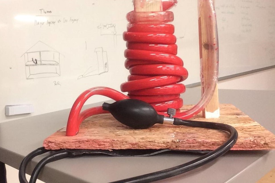
After the first iteration of the prototype, we felt that to make it more provocative, we had to turn the watercolor to red color because the red colors would be the best to indicate the bloodshed. We also thought that the tube should be transparent, which could be visible. Furthermore, we have adjusted the blood pressure materials into the prototype to make it interactive, so the more a person presses it, the amount of the water rises in the tube.

We wanted to adjust the volume of the water automatically by pressing some button, and each button could represent a country, but due to having limited time, we could able to go further.

Presentation Day

All the group presented their prototype, but most of them were just the sketches and tried to explain their concepts, but personally, I felt that these sketches have to develop to the next level to make it provocative. The sketches were the minimum requirement for this assignment, but in such a short period, just the sketches can be expected from students in such a vital subject. During our group presentation, we have provided some awareness about the crisis that is going in the third world countries and explain the responsibility of media, international community. Then we came to our main subject that why these crises are not given enough coverage in media, the way they used to broadcast such incidents, and why the international community does not stand with these people, in the way they stand beside the western people.

Finally, we presented our prototype that showed a high level of bloodshed in eastern countries that equal to a low level of bloodshed in the western countries for international communities. We also attached a pressure material as an interactive part to higher or lower the level of bloodshed graph, that most of the students thought it is a functional prototype. The lecturer said that the topic of the project is coherence with the material of the project. The red color that indicates bloodshed and comparison between two different data in such a concept is very provocative. She also recommended us to work on this prototype and develop it furthermore as our final project.

The Glanceability

Today, David briefly explained the entire course structure, including all upcoming lectures and assignments with a different lecturer each week. I thought that the whole month would be very stressful and tough because from overview picture of the whole course seems to be super fast with a tight schedule, and we have to present a new project at the end of each week.

The main topic was about glanceability. Basically, it is a visual interaction with a smaller screen, and the glance should be less than 5 seconds. I believed that in the future, glanceability would have a prime and important aspect. Tomorrow’s world is all about information, and some of them are important to know, but we would not have enough time to explore and read each piece of information. Through glanceability, we could identify and manage our plan accordingly.

As a demo, we were divided into groups, and each group member supposed to write all the activities that we do in the morning before leaving the house. We wrote down horizontally each activity. Then in the second iteration, we were instructed to keep just four activities that are important for us and had to remove the rest. The demo helped me to understand the situation clearly by just one glance that each member of our group has almost does the same important activity in the morning, such as bathing, brushing, eating. So, to have to keep an eye on our important information, the glanceability factor is crucial to understand.

Weekly Project

The assignment requirement was that we have to make a video prototype regarding glanceability. We have to frame out a scenario that shows the functionality and interaction of the glanceable device. The important part was that the audiences have to understand how the device works, and we can explain the context by talking.

We chose the smartwatch as a glanceable device to interact with and tried to come up with different ideas and thoughts. Personally, I thought more about those subjects that people are mostly concern about it, most of the time, such as the safety of family members, lockers or door monitor. The group agreed to work on the smartwatch project in which a person can see the status of the entrance door at a house by one glance and interact with the device by touching the interface.

After recording the video scene by scene, we need it to edit the video properly and show the concept of glanceability clearly that the viewer should understand the scenario. All the group members were new to adobe premiere, but through googling, we were able to edit it properly. The challenging part while video editing was to add special effects and animation in the video.

The group got a harsh critic from the lecturer on presentation day. We have delivered the wrong impression that the group did not put effort into the project and prepared the least requirement for the assignment. Actually, it was a 12 hours job, but we spent more than 12 hours, and video editing was really time-consuming, but still, that critic was alarming to our group members to work harder.

Design a site like this with WordPress.com
Get started