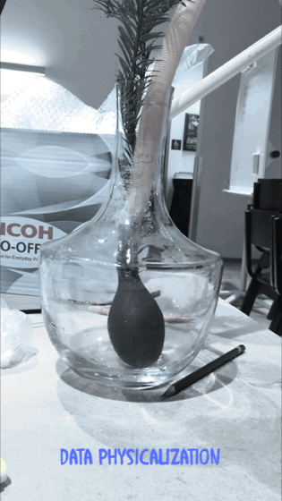
Today’s lesson was about data visualization and physicalization. Furthermore, we also got to know a bit about data physicalization history and how, in the past decade’s people wanted to see data in a physical form. I thought that at that time, people would have limited access to data because the technology and resources were not developed as now. Later, I have understood that how they used cube, balloon, and bars to shape the data in a physical form. However, I was more curious to know more about their motive to see the data in the physical form and how they collect their data. Usually, at that time, people were processing the data for information.
The next topic that has been point out was about static data and dynamic data. This subject was more straightforward to me, and the first example came up to my mind was the monthly salary, which static due to the amount is fixed, and the same amount is being deposited every month, according to the agreement signed. However, when a person started to pay for monthly expenses that could be dynamic due to it could be deffer in each month, and the amounts keep changing every month according to the person’s expenses. In this case, it is also means that static data is non-controllable, but dynamic can be control and effect according to the behavior of the object. The only question that I was concern about it that there are elements that provide data in both forms of static and dynamic such as electricity bills. The charges for line and meter are fixed, but the charges for the units are variable, which is dependent on the user’s consumption. So what do we say for such data that is generated in both forms?
The last part of today’s lecture was about the difference between informative data and provocative data, and before the lecturer explains it more. We got a chance to think a bit and differentiate between these two sorts of data. My first thought was that both sorts of data give information. The informative data deliver knowledge about the status of something, but it does not force me to react. Provocative data force the user to react else it would be too late to take action. The best example could be the car fuel indicator when it half; Through that level graph, it delivers information that the car has left half fuel, but I have the option to refill it or do it later. However, if the indicator reaches the bottom, and the red light turns on, then I have to refill it before the car is out of gas.
Weekly Project
The central concept of the assignment was to come up with a design that could show data in a physical form. The data should be informative and provocative and coherent with each other.
During the ideation part, we had several ideas in this context of the data physicalization. We thought about the kitchen oven, pollution, and reaction of western media to violence that happens on different parts of continents. The concept of the kitchen oven was to show the degree level of food cooked. We thought this is more informative and less provocative, and everyone would prefer to see such data in digital form instead of in a physical form. The two other ideas were more provocative and informative. However, the majority of members in the group chose to work with the Media reaction. The implementation of our idea was challenging, and our main focus was that the prototype must provoke its spectators so, presenting just a paper prototype could be an injustice for such a political topic. We were looking to design a model that should have the capacity to shift its size or form. The only object that came to my mind was a balloon or a tube. After some sketches, we decided to go with a tube and could change the volume by increasing or decreasing the water inside the tube.
After the first iteration of the prototype, we felt that to make it more provocative, we had to turn the watercolor to red color because the red colors would be the best to indicate the bloodshed. We also thought that the tube should be transparent, which could be visible. Furthermore, we have adjusted the blood pressure materials into the prototype to make it interactive, so the more a person presses it, the amount of the water rises in the tube.

We wanted to adjust the volume of the water automatically by pressing some button, and each button could represent a country, but due to having limited time, we could able to go further.
Presentation Day
All the group presented their prototype, but most of them were just the sketches and tried to explain their concepts, but personally, I felt that these sketches have to develop to the next level to make it provocative. The sketches were the minimum requirement for this assignment, but in such a short period, just the sketches can be expected from students in such a vital subject. During our group presentation, we have provided some awareness about the crisis that is going in the third world countries and explain the responsibility of media, international community. Then we came to our main subject that why these crises are not given enough coverage in media, the way they used to broadcast such incidents, and why the international community does not stand with these people, in the way they stand beside the western people.
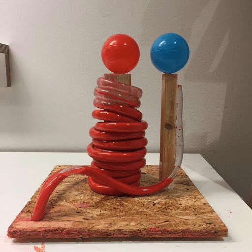
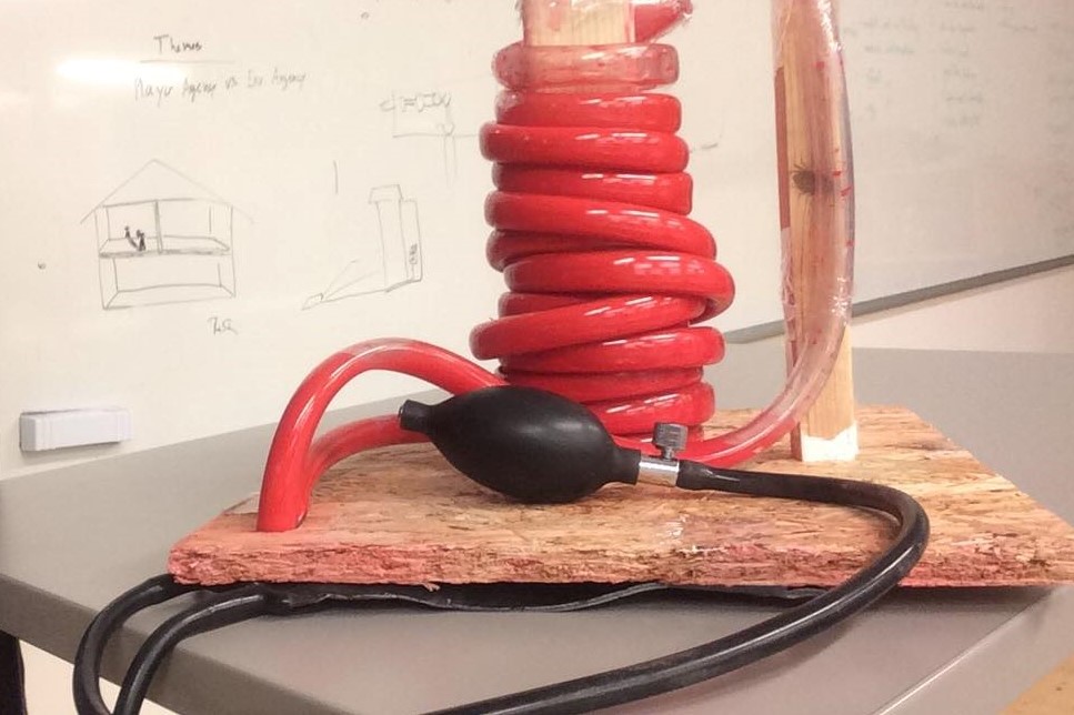
Finally, we presented our prototype that showed a high level of bloodshed in eastern countries that equal to a low level of bloodshed in the western countries for international communities. We also attached a pressure material as an interactive part to higher or lower the level of bloodshed graph, that most of the students thought it is a functional prototype. The lecturer said that the topic of the project is coherence with the material of the project. The red color that indicates bloodshed and comparison between two different data in such a concept is very provocative. She also recommended us to work on this prototype and develop it furthermore as our final project.
